








Climate change and temperature anomalies
Combined Land-Surface Air and Sea-Surface Water Temperature Anomalies in the Northern Hemisphere at NASA’s Goddard Institute for Space Studies. tabular data of temperature anomalies
To define temperature anomalies you need to have a reference, or base, period which NASA clearly states that it is the period between 1951-1980.
weather <-
  read_csv("https://data.giss.nasa.gov/gistemp/tabledata_v4/NH.Ts+dSST.csv",
           skip = 1,
           na = "***",
           show_col_types = FALSE)
tidyweather <- weather %>%
select(1:13) %>%
pivot_longer(
cols=2:13,
names_to = 'Month',
values_to = 'delta'
)Plotting Information
tidyweather <- tidyweather %>%
  mutate(date = ymd(paste(as.character(Year), Month, "1")),
         month = month(date, label=TRUE),
         year = year(date))

ggplot(tidyweather, aes(x=date, y = delta))+
  geom_point()+
  geom_smooth(color="red") +
  theme_bw() +
  labs (
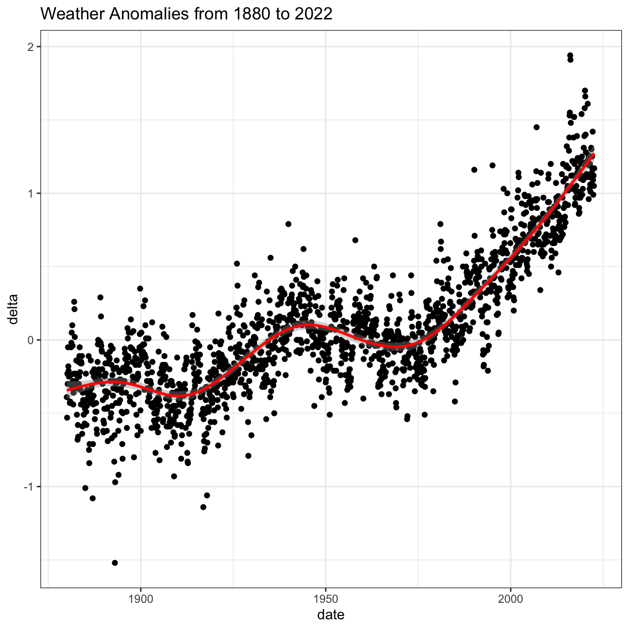
    title = "Weather Anomalies from 1880 to 2022"
  )
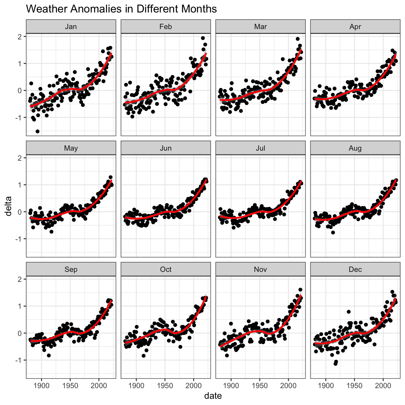
Now, we can inspect Weather Anomalies by months.
comparison <- tidyweather %>%
  filter(Year>= 1881) %>%     #remove years prior to 1881
  #create new variable 'interval', and assign values based on criteria below:
  mutate(interval = case_when(
    Year %in% c(1881:1920) ~ "1881-1920",
    Year %in% c(1921:1950) ~ "1921-1950",
    Year %in% c(1951:1980) ~ "1951-1980",
    Year %in% c(1981:2010) ~ "1981-2010",
    TRUE ~ "2011-present"
  ))

comparison
## # A tibble: 1,704 × 7
## Year Month delta date month year interval
## <dbl> <fct> <dbl> <date> <ord> <dbl> <chr>
## 1 1881 Jan -0.3 1881-01-01 Jan 1881 1881-1920
## 2 1881 Feb -0.24 1881-02-01 Feb 1881 1881-1920
## 3 1881 Mar -0.05 1881-03-01 Mar 1881 1881-1920
## 4 1881 Apr -0.02 1881-04-01 Apr 1881 1881-1920
## 5 1881 May 0.05 1881-05-01 May 1881 1881-1920
## 6 1881 Jun -0.33 1881-06-01 Jun 1881 1881-1920
## 7 1881 Jul 0.1 1881-07-01 Jul 1881 1881-1920
## 8 1881 Aug -0.04 1881-08-01 Aug 1881 1881-1920
## 9 1881 Sep -0.28 1881-09-01 Sep 1881 1881-1920
## 10 1881 Oct -0.44 1881-10-01 Oct 1881 1881-1920
## # … with 1,694 more rows
## # ℹ Use `print(n = ...)` to see more rowsWe have add the intervals to the previous data.
ggplot(comparison, aes(x=delta, fill=interval))+
  geom_density(alpha=.3)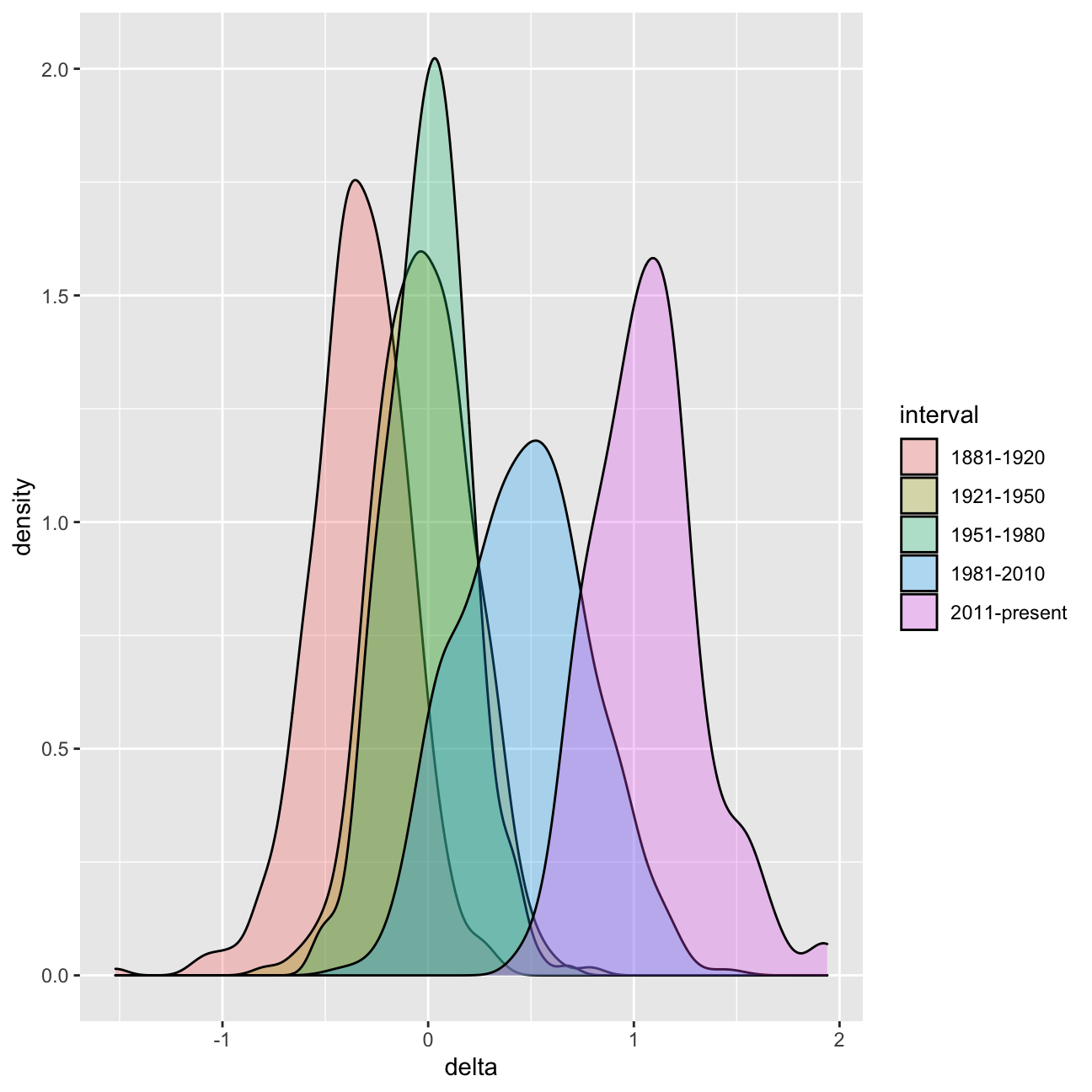
#creating yearly averages
average_annual_anomaly <- tidyweather %>%
  group_by(Year) %>%   #grouping data by Year

  # creating summaries for mean delta
  # use `na.rm=TRUE` to eliminate NA (not available) values
  summarise(delta = mean(delta, na.rm=TRUE))

#plotting the data:

ggplot(average_annual_anomaly,aes(x=Year,y=delta))+
  geom_point()+
  geom_smooth(method = "loess")+
  theme_bw()+
  labs(title = "Average Annual Weather Anomalies")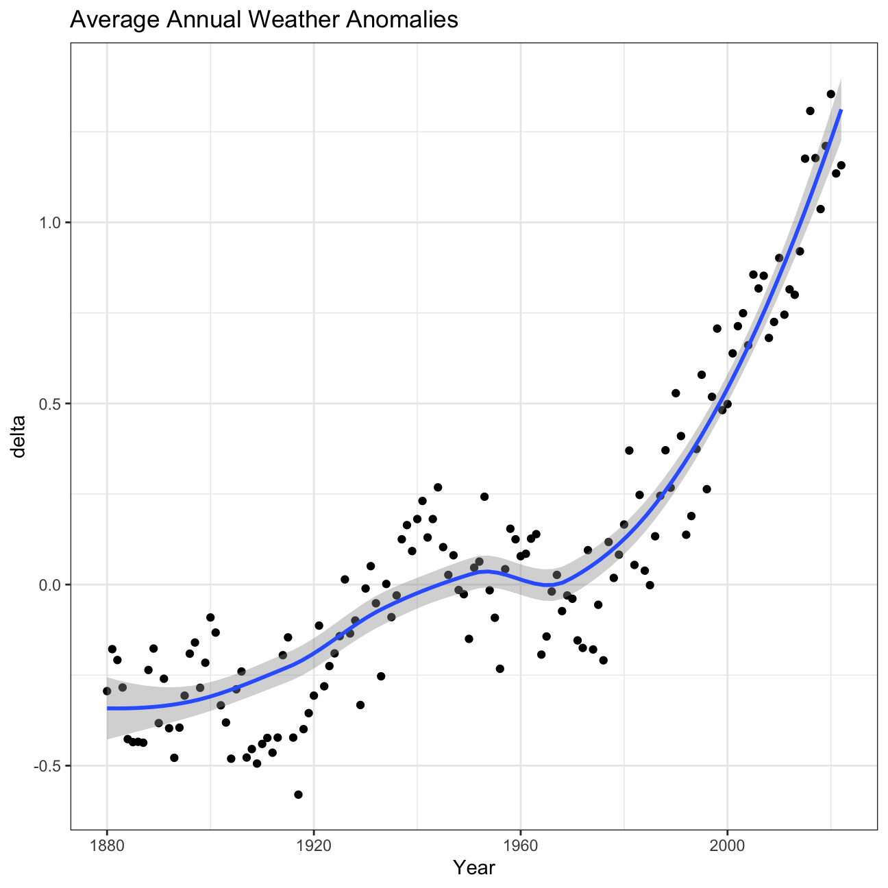
Confidence Interval for delta
NASA points out on their website that
A one-degree global change is significant because it takes a vast amount of heat to warm all the oceans, atmosphere, and land by that much. In the past, a one- to two-degree drop was all it took to plunge the Earth into the Little Ice Age.
formula_ci <- comparison %>%
  filter(interval == "2011-present") %>%
  summarize(Mean = mean(delta, na.rm = TRUE),
            StdDev = sd(delta, na.rm =TRUE),
            Count = n(),
            StdError = StdDev/sqrt(Count),
            t_criticial = qt(0.975, Count-1),
            MarginOfError = t_criticial*StdError,
            LowerPerc = Mean-MarginOfError,
            UpperPerc = Mean+MarginOfError,
            )

set.seed(1234)

bootstrap_ci <- comparison %>%
  filter(interval == "2011-present") %>%
  specify(response = delta) %>%
  generate(reps = 10000, type = "bootstrap") %>%
  calculate(stat = "mean")

confidence_int_bootstrap <- bootstrap_ci %>%
  get_confidence_interval(level = 0.95, type = "percentile")

#print out formula_CI
formula_ci
## # A tibble: 1 × 8
## Mean StdDev Count StdError t_criticial MarginOfError LowerPerc UpperPerc
## <dbl> <dbl> <int> <dbl> <dbl> <dbl> <dbl> <dbl>
## 1 1.07 0.265 144 0.0221 1.98 0.0437 1.02 1.11confidence_int_bootstrap## # A tibble: 1 × 2
## lower_ci upper_ci
## <dbl> <dbl>
## 1 1.02 1.11What is the data showing us? Please type your answer after (and outside!) this blockquote. You have to explain what you have done, and the interpretation of the result.
We first drew a graph of weather anomalies of the Northern Hemisphere from 1880 to 2022 and discovered that with small fluctuations, weather anomalies have risen in the past two centuries. Next, we drew the same graph faceted by months and discovered that most months follow the same rising pattern, with exceptions of April, May, and July. Adding intervals, to the previous data and calculating Confidence Interval with formula, we are 95% confident to conclude that the mean of the population falls between 1.02 and 1.11
Challenge 2: Share of renewable energy production in the world
The National Bureau of Economic Research (NBER) has a a very interesting dataset on the adoption of about 200 technologies in more than 150 countries since 1800. This is theCross-country Historical Adoption of Technology (CHAT) dataset.
technology <- readr::read_csv('https://raw.githubusercontent.com/rfordatascience/tidytuesday/master/data/2022/2022-07-19/technology.csv')

#get all technologies
labels <- technology %>%
  distinct(variable, label)

# Get country names using 'countrycode' package
technology <- technology %>%
  filter(iso3c != "XCD") %>%
  mutate(iso3c = recode(iso3c, "ROM" = "ROU"),
         country = countrycode(iso3c, origin = "iso3c", destination = "country.name"),
         country = case_when(
           iso3c == "ANT" ~ "Netherlands Antilles",
           iso3c == "CSK" ~ "Czechoslovakia",
           iso3c == "XKX" ~ "Kosovo",
           TRUE           ~ country))

#make smaller dataframe on energy
energy <- technology %>%
  filter(category == "Energy") %>%
  filter(variable !="electric_gen_capacity")

wbdata_save <- read_csv("https://raw.githubusercontent.com/jas0nh/hello-world/master/wbdata_save.csv",show_col_types = FALSE)

co2_percap <- wbdata_save %>%
  filter(!is.na(value)) %>%
  #drop unwanted variables
  select(-c(unit, obs_status, footnote, last_updated))


# get a list of countries and their characteristics
# we just want to get the region a country is in and its income level

countries <-  wb_countries() %>%
  select(country, iso3c, income_level) %>%
  filter(income_level!="Aggregates")
This is a very rich data set, not just for energy and CO2 data, but for many other technologies. In our case, we just need to produce a couple of graphs– at this stage, the emphasis is on data manipulation, rather than making the graphs gorgeous.
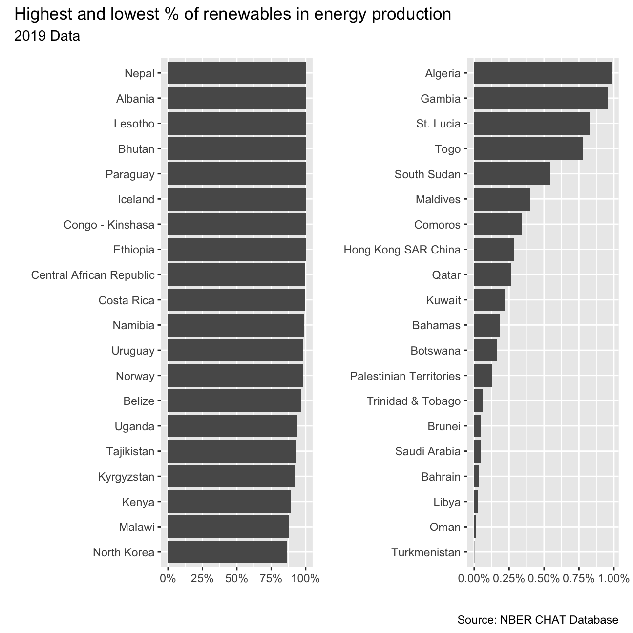
First, produce a graph with the countries with the highest and lowest %
contribution of renewables in energy production. This is made up of
elec_hydro, elec_solar, elec_wind, and elec_renew_other. You may
want to use the patchwork package to assemble the two charts next to
each other.
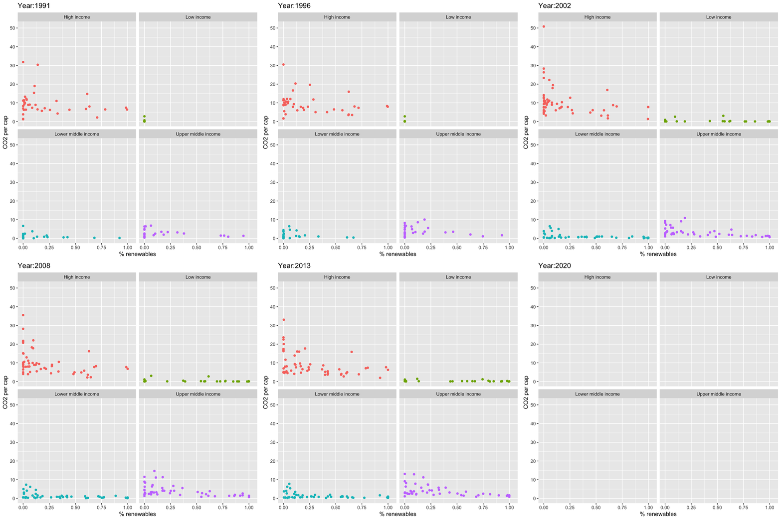
As the % of energy generated by renewables goes up, do CO2 per capita emissions seem to go down?
From the animation, we can tell that from 1991 to 2020, CO2 per capita emissions semm to go dowanwards with the rate of energy generated by renewables rises.
## <ggproto object: Class EaseAes, gg>
##     aes_names:
##     aesthetics:
##     default: linear
##     get_ease: function
##     super:  <ggproto object: Class EaseAes, gg>