








1. My Bio
Hello everyone! I’m Zhicheng Huang from China. You can also call me Jason. And this is me in Sichuan, China flying my drone.

3. Likes
Here are a couple of things that I enjoy:
- Photography
- Hiking
- Gaming
You have seen the gapminder dataset that has data on life expectancy, population, and GDP per capita for 142 countries from 1952 to 2007. To get a glimpse of the dataframe, namely to see the variable names, variable types, etc., we use the glimpse function. We also want to have a look at the first 20 rows of data.
glimpse(gapminder)## Rows: 1,704
## Columns: 6
## $ country <fct> "Afghanistan", "Afghanistan", "Afghanistan", "Afghanistan", …
## $ continent <fct> Asia, Asia, Asia, Asia, Asia, Asia, Asia, Asia, Asia, Asia, …
## $ year <int> 1952, 1957, 1962, 1967, 1972, 1977, 1982, 1987, 1992, 1997, …
## $ lifeExp <dbl> 28.801, 30.332, 31.997, 34.020, 36.088, 38.438, 39.854, 40.8…
## $ pop <int> 8425333, 9240934, 10267083, 11537966, 13079460, 14880372, 12…
## $ gdpPercap <dbl> 779.4453, 820.8530, 853.1007, 836.1971, 739.9811, 786.1134, …head(gapminder, 20) # look at the first 20 rows of the dataframe## # A tibble: 20 × 6
## country continent year lifeExp pop gdpPercap
## <fct> <fct> <int> <dbl> <int> <dbl>
## 1 Afghanistan Asia 1952 28.8 8425333 779.
## 2 Afghanistan Asia 1957 30.3 9240934 821.
## 3 Afghanistan Asia 1962 32.0 10267083 853.
## 4 Afghanistan Asia 1967 34.0 11537966 836.
## 5 Afghanistan Asia 1972 36.1 13079460 740.
## 6 Afghanistan Asia 1977 38.4 14880372 786.
## 7 Afghanistan Asia 1982 39.9 12881816 978.
## 8 Afghanistan Asia 1987 40.8 13867957 852.
## 9 Afghanistan Asia 1992 41.7 16317921 649.
## 10 Afghanistan Asia 1997 41.8 22227415 635.
## 11 Afghanistan Asia 2002 42.1 25268405 727.
## 12 Afghanistan Asia 2007 43.8 31889923 975.
## 13 Albania Europe 1952 55.2 1282697 1601.
## 14 Albania Europe 1957 59.3 1476505 1942.
## 15 Albania Europe 1962 64.8 1728137 2313.
## 16 Albania Europe 1967 66.2 1984060 2760.
## 17 Albania Europe 1972 67.7 2263554 3313.
## 18 Albania Europe 1977 68.9 2509048 3533.
## 19 Albania Europe 1982 70.4 2780097 3631.
## 20 Albania Europe 1987 72 3075321 3739.I have created the country_data and continent_data with the code below.
country_data <- gapminder %>%
            filter(country == "China")

continent_data <- gapminder %>%
            filter(continent == "Asia")
First, create a plot of life expectancy over time for the single country you chose. Map year on the x-axis, and lifeExp on the y-axis. You should also use geom_point() to see the actual data points and geom_smooth(se = FALSE) to plot the underlying trendlines.
plot1 <- ggplot(data = country_data, mapping = aes(x = year, y = lifeExp)) +
  geom_point() +
  geom_smooth(se = FALSE)+
  NULL

plot1
## `geom_smooth()` using method = 'loess' and formula 'y ~ x'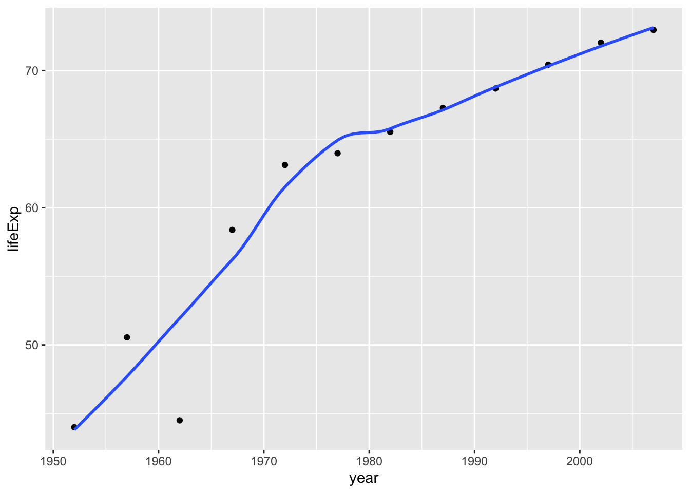
plot1<- plot1 +
  labs(title = "Chinese People's Life Expectancy over Years",
      x = "Year",
      y = "Life Expectancy") +
  NULL

plot1
## `geom_smooth()` using method = 'loess' and formula 'y ~ x'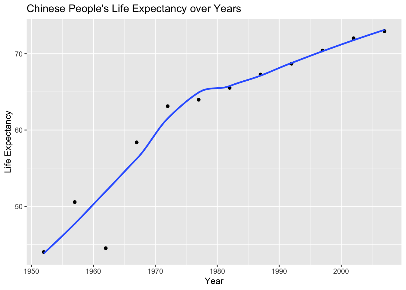
Secondly, produce a plot for all countries in the continent you come from.
ggplot(continent_data, mapping = aes(x =year, y =lifeExp, colour= country, group =country))+
 geom_point() +
 geom_smooth(se = FALSE) +
 NULL
## `geom_smooth()` using method = 'loess' and formula 'y ~ x'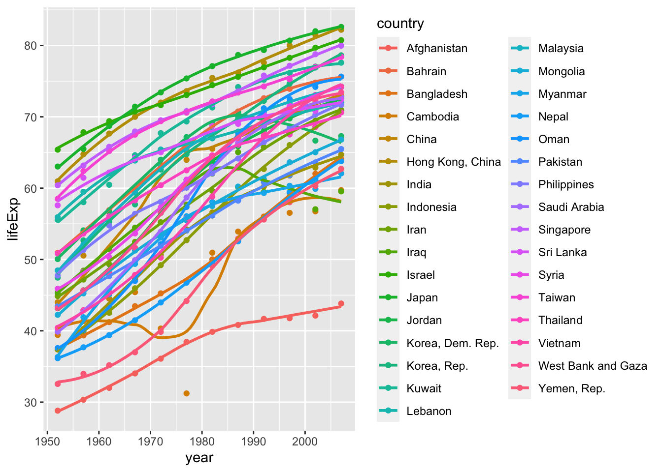
Finally, using the original gapminder data, produce a life expectancy over time graph, grouped (or faceted) by continent. We will remove all legends, adding the theme(legend.position="none") in the end of our ggplot.
ggplot(data = gapminder , mapping = aes(x =year  , y =lifeExp  , colour=country ))+
  geom_point() +
  geom_smooth(se = FALSE) +
  facet_wrap(~continent) +
  theme(legend.position="none") + #remove all legends
  NULL
## `geom_smooth()` using method = 'loess' and formula 'y ~ x'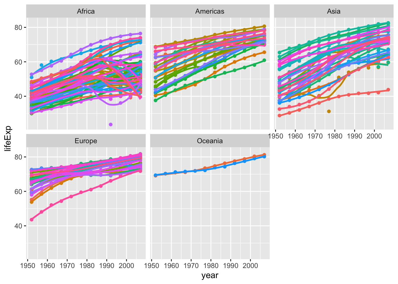
Given these trends, what can you say about life expectancy since 1952?
Generally speaking, life expectancy is gradually rising in most countries since 1952. However, there are differences between continents.
- In Europe and Oceania, most countries are developed. Life expectancy in these countries are rising steadily, probably due to the gradual innovation of medical care and social welfare.
- In Africa, most countries are developing ones. They started with a low life expectancy, and showed a rapid growth due to help from developed countries. However, maybe because of epidemic diseases, famine and wars, some countries are experiencing a life expectancy drop in recent years.
- Situations in Asia and Americas are in between. These continents are a combination of developed and developing countries. So, the situation regarding life expectancy of different countries over time varies.
Task 3: Brexit vote analysis
We will have a look at the results of the 2016 Brexit vote in the UK. First we read the data using read_csv() and have a quick glimpse at the data
# read data directly off github repo
brexit_results <- read_csv("https://raw.githubusercontent.com/kostis-christodoulou/am01/master/data/brexit_results.csv")

glimpse(brexit_results)
## Rows: 632
## Columns: 11
## $ Seat <chr> "Aldershot", "Aldridge-Brownhills", "Altrincham and Sale W…
## $ con_2015 <dbl> 50.592, 52.050, 52.994, 43.979, 60.788, 22.418, 52.454, 22…
## $ lab_2015 <dbl> 18.333, 22.369, 26.686, 34.781, 11.197, 41.022, 18.441, 49…
## $ ld_2015 <dbl> 8.824, 3.367, 8.383, 2.975, 7.192, 14.828, 5.984, 2.423, 1…
## $ ukip_2015 <dbl> 17.867, 19.624, 8.011, 15.887, 14.438, 21.409, 18.821, 21.…
## $ leave_share <dbl> 57.89777, 67.79635, 38.58780, 65.29912, 49.70111, 70.47289…
## $ born_in_uk <dbl> 83.10464, 96.12207, 90.48566, 97.30437, 93.33793, 96.96214…
## $ male <dbl> 49.89896, 48.92951, 48.90621, 49.21657, 48.00189, 49.17185…
## $ unemployed <dbl> 3.637000, 4.553607, 3.039963, 4.261173, 2.468100, 4.742731…
## $ degree <dbl> 13.870661, 9.974114, 28.600135, 9.336294, 18.775591, 6.085…
## $ age_18to24 <dbl> 9.406093, 7.325850, 6.437453, 7.747801, 5.734730, 8.209863…The data comes from Elliott Morris, who cleaned it and made it available through his DataCamp class on analysing election and polling data in R.
Our main outcome variable (or y) is leave_share, which is the percent of votes cast in favour of Brexit, or leaving the EU. Each row is a UK parliament constituency.
To get a sense of the spread, or distribution, of the data, we can plot a histogram, a density plot, and the empirical cumulative distribution function of the leave % in all constituencies.
# histogram
ggplot(brexit_results, aes(x = leave_share)) +
  geom_histogram(binwidth = 2.5)+
  labs(title = "Brexit Leave Share Distribution of Seats",
      subtitle = "Histogram",
      x = "Leave Share(%)",
y = "Count") 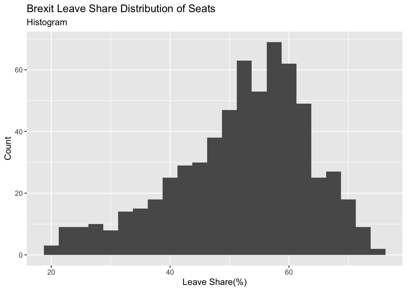
# density plot-- think smoothed histogram
ggplot(brexit_results, aes(x = leave_share)) +
  geom_density()+
  labs(title = "Brexit Leave Share Distribution of Seats",
      subtitle = "Density",
      x = "Leave Share(%)",
y = "Density") 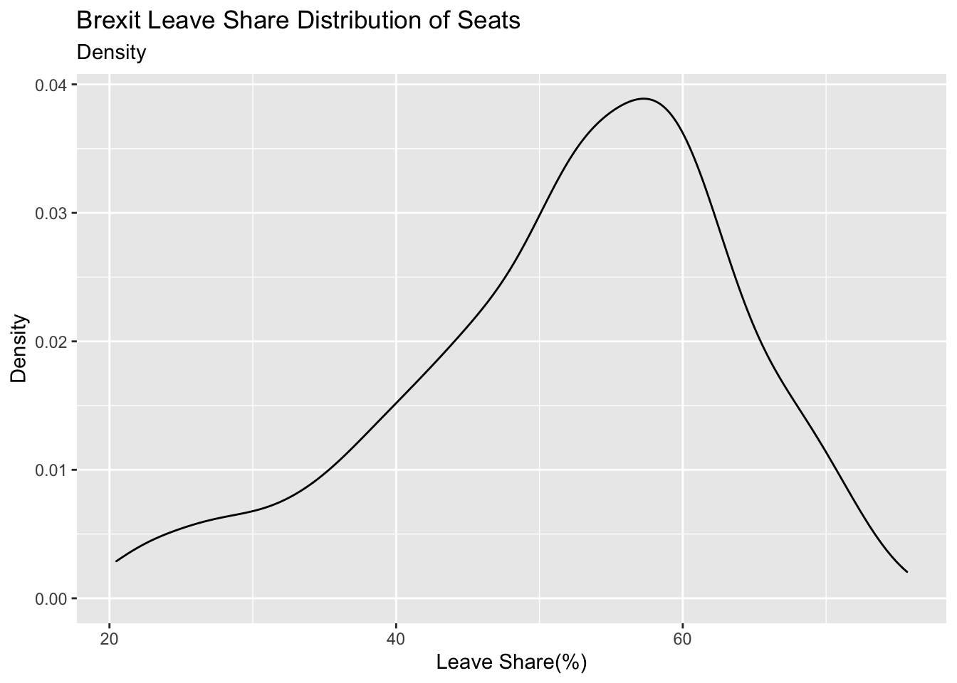
# The empirical cumulative distribution function (ECDF)
ggplot(brexit_results, aes(x = leave_share)) +
  stat_ecdf(geom = "step", pad = FALSE) +
  scale_y_continuous(labels = scales::percent)+
  labs(title = "Brexit Leave Share Distribution of Seats",
      subtitle = "The Empirical Cumulative Distribution Function",
      x = "Leave Share(%)",
y = "Cumulative Probability") 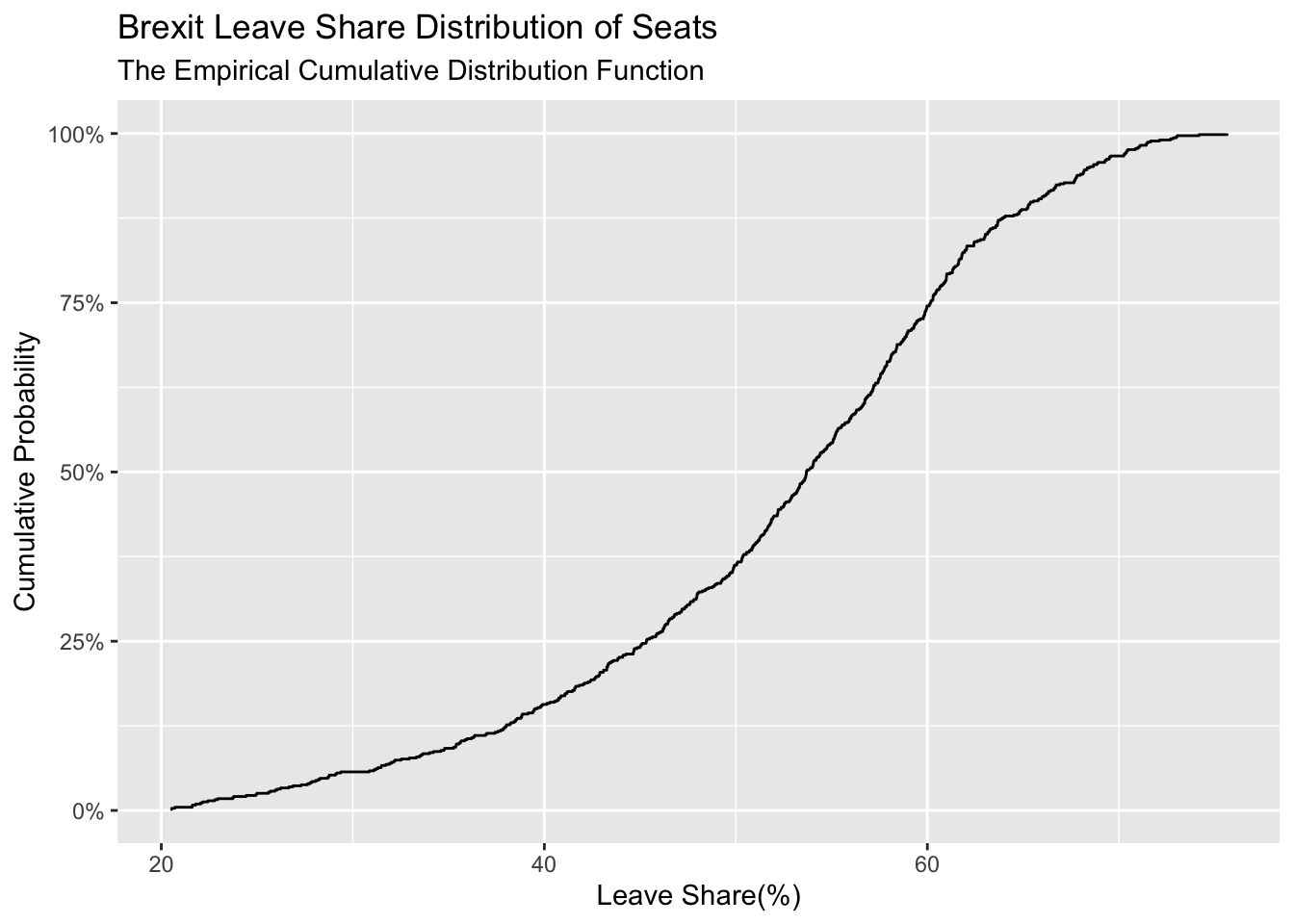
One common explanation for the Brexit outcome was fear of immigration and opposition to the EU’s more open border policy. We can check the relationship (or correlation) between the proportion of native born residents (born_in_uk) in a constituency and its leave_share. To do this, let us get the correlation between the two variables
brexit_results %>%
  select(leave_share, born_in_uk) %>%
  cor()
## leave_share born_in_uk
## leave_share 1.0000000 0.4934295
## born_in_uk 0.4934295 1.0000000The correlation is almost 0.5, which shows that the two variables are positively correlated.
We can also create a scatterplot between these two variables using geom_point. We also add the best fit line, using geom_smooth(method = "lm").
ggplot(brexit_results, aes(x = born_in_uk, y = leave_share)) +
  geom_point(alpha=0.3) +

  # add a smoothing line, and use method="lm" to get the best straight-line
  geom_smooth(method = "lm") +

  # use a white background and frame the plot with a black box
  theme_bw() +

  # Lables
  labs(title = "Correlation Between Born in the UK Rate and Leave Share",
    subtitle = "Scatterplot and Best Fit Line",
    x = "Born in the UK Percentage(%)",
    y = "Leave Share(%)")
## `geom_smooth()` using formula 'y ~ x'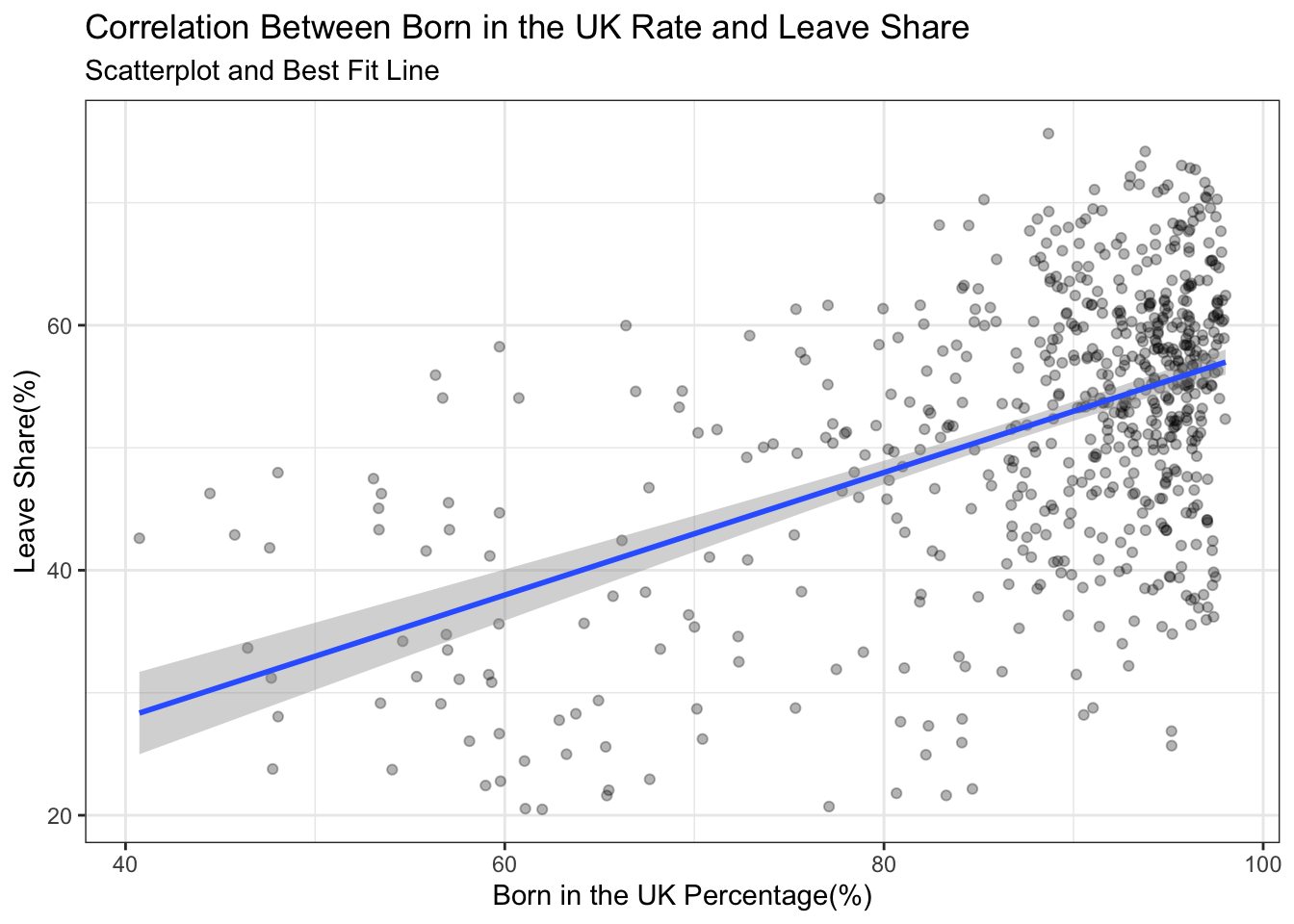
You have the code for the plots, I would like you to revisit all of them and use the labs() function to add an informative title, subtitle, and axes titles to all plots.
What can you say about the relationship shown above? Again, don’t just say what’s happening in the graph. Tell some sort of story and speculate about the differences in the patterns.
Type your answer after, and outside, this blockquote.
The distribution of different seats’ leave share is a negative skewness distribution. It indicates that more seats’ voters are thinking about leaving the EU. From the last graph, we noticed that leave share is related to born in the UK percentage. It’s maybe because UK born voters are less likely to welcome immigrates to become a UK citizen and take up their chances of finding works and enjoying other resources.
Task 4: Animal rescue incidents attended by the London Fire Brigade
The London Fire Brigade attends a range of non-fire incidents (which we call ‘special services’). These ‘special services’ include assistance to animals that may be trapped or in distress. The data is provided from January 2009 and is updated monthly. A range of information is supplied for each incident including some location information (postcode, borough, ward), as well as the data/time of the incidents. We do not routinely record data about animal deaths or injuries.
Please note that any cost included is a notional cost calculated based on the length of time rounded up to the nearest hour spent by Pump, Aerial and FRU appliances at the incident and charged at the current Brigade hourly rate.
url <- "https://data.london.gov.uk/download/animal-rescue-incidents-attended-by-lfb/f43b485e-fb35-419c-aa7a-fa75676e5835/Animal%20Rescue%20incidents%20attended%20by%20LFB%20from%20Jan%202009.csv"


animal_rescue <- read_csv(url,
                          locale = locale(encoding = "CP1252")) %>%
  janitor::clean_names()


glimpse(animal_rescue)
## Rows: 8,751
## Columns: 31
## $ incident_number <chr> "139091", "275091", "2075091", "2872091"…
## $ date_time_of_call <chr> "01/01/2009 03:01", "01/01/2009 08:51", …
## $ cal_year <dbl> 2009, 2009, 2009, 2009, 2009, 2009, 2009…
## $ fin_year <chr> "2008/09", "2008/09", "2008/09", "2008/0…
## $ type_of_incident <chr> "Special Service", "Special Service", "S…
## $ pump_count <chr> "1", "1", "1", "1", "1", "1", "1", "1", …
## $ pump_hours_total <chr> "2", "1", "1", "1", "1", "1", "1", "1", …
## $ hourly_notional_cost <dbl> 255, 255, 255, 255, 255, 255, 255, 255, …
## $ incident_notional_cost <chr> "510", "255", "255", "255", "255", "255"…
## $ final_description <chr> "Redacted", "Redacted", "Redacted", "Red…
## $ animal_group_parent <chr> "Dog", "Fox", "Dog", "Horse", "Rabbit", …
## $ originof_call <chr> "Person (land line)", "Person (land line…
## $ property_type <chr> "House - single occupancy", "Railings", …
## $ property_category <chr> "Dwelling", "Outdoor Structure", "Outdoo…
## $ special_service_type_category <chr> "Other animal assistance", "Other animal…
## $ special_service_type <chr> "Animal assistance involving livestock -…
## $ ward_code <chr> "E05011467", "E05000169", "E05000558", "…
## $ ward <chr> "Crystal Palace & Upper Norwood", "Woods…
## $ borough_code <chr> "E09000008", "E09000008", "E09000029", "…
## $ borough <chr> "Croydon", "Croydon", "Sutton", "Hilling…
## $ stn_ground_name <chr> "Norbury", "Woodside", "Wallington", "Ru…
## $ uprn <chr> "NULL", "NULL", "NULL", "1.00E+11", "NUL…
## $ street <chr> "Waddington Way", "Grasmere Road", "Mill…
## $ usrn <chr> "20500146", "NULL", "NULL", "21401484", …
## $ postcode_district <chr> "SE19", "SE25", "SM5", "UB9", "RM3", "RM…
## $ easting_m <chr> "NULL", "534785", "528041", "504689", "N…
## $ northing_m <chr> "NULL", "167546", "164923", "190685", "N…
## $ easting_rounded <dbl> 532350, 534750, 528050, 504650, 554650, …
## $ northing_rounded <dbl> 170050, 167550, 164950, 190650, 192350, …
## $ latitude <chr> "NULL", "51.39095371", "51.36894086", "5…
## $ longitude <chr> "NULL", "-0.064166887", "-0.161985191", …One of the more useful things one can do with any data set is quick counts, namely to see how many observations fall within one category. For instance, if we wanted to count the number of incidents by year, we would either use group_by()... summarise() or, simply count()
animal_rescue %>%
  dplyr::group_by(cal_year) %>%
  summarise(count=n())
## # A tibble: 14 × 2
## cal_year count
## <dbl> <int>
## 1 2009 568
## 2 2010 611
## 3 2011 620
## 4 2012 603
## 5 2013 585
## 6 2014 583
## 7 2015 540
## 8 2016 604
## 9 2017 539
## 10 2018 610
## 11 2019 604
## 12 2020 758
## 13 2021 885
## 14 2022 641animal_rescue %>%
count(cal_year, name="count")## # A tibble: 14 × 2
## cal_year count
## <dbl> <int>
## 1 2009 568
## 2 2010 611
## 3 2011 620
## 4 2012 603
## 5 2013 585
## 6 2014 583
## 7 2015 540
## 8 2016 604
## 9 2017 539
## 10 2018 610
## 11 2019 604
## 12 2020 758
## 13 2021 885
## 14 2022 641Let us try to see how many incidents we have by animal group. Again, we can do this either using group_by() and summarise(), or by using count()
animal_rescue %>%
  group_by(animal_group_parent) %>%

  #group_by and summarise will produce a new column with the count in each animal group
  summarise(count = n()) %>%

  # mutate adds a new column; here we calculate the percentage
  mutate(percent = round(100*count/sum(count),2)) %>%

  # arrange() sorts the data by percent. Since the default sorting is min to max and we would like to see it sorted
  # in descending order (max to min), we use arrange(desc())
  arrange(desc(percent))
## # A tibble: 28 × 3
## animal_group_parent count percent
## <chr> <int> <dbl>
## 1 Cat 4232 48.4
## 2 Bird 1803 20.6
## 3 Dog 1341 15.3
## 4 Fox 455 5.2
## 5 Unknown - Domestic Animal Or Pet 215 2.46
## 6 Horse 201 2.3
## 7 Deer 152 1.74
## 8 Unknown - Wild Animal 102 1.17
## 9 Squirrel 75 0.86
## 10 Unknown - Heavy Livestock Animal 50 0.57
## # … with 18 more rows
## # ℹ Use `print(n = ...)` to see more rowsanimal_rescue %>%
#count does the same thing as group_by and summarise
# name = "count" will call the column with the counts "count" ( exciting, I know)
# and 'sort=TRUE' will sort them from max to min
count(animal_group_parent, name="count", sort=TRUE) %>%
mutate(percent = round(100*count/sum(count),2))## # A tibble: 28 × 3
## animal_group_parent count percent
## <chr> <int> <dbl>
## 1 Cat 4232 48.4
## 2 Bird 1803 20.6
## 3 Dog 1341 15.3
## 4 Fox 455 5.2
## 5 Unknown - Domestic Animal Or Pet 215 2.46
## 6 Horse 201 2.3
## 7 Deer 152 1.74
## 8 Unknown - Wild Animal 102 1.17
## 9 Squirrel 75 0.86
## 10 Unknown - Heavy Livestock Animal 50 0.57
## # … with 18 more rows
## # ℹ Use `print(n = ...)` to see more rowsDo you see anything strange in these tables?
The data wasn’t well cleaned, so there are some overlaps between different items - like two “Cats”.
Finally, let us have a look at the notional cost for rescuing each of these animals. As the LFB says,
Please note that any cost included is a notional cost calculated based on the length of time rounded up to the nearest hour spent by Pump, Aerial and FRU appliances at the incident and charged at the current Brigade hourly rate.
There is two things we will do:
- Calculate the mean and median
incident_notional_costfor eachanimal_group_parent - Plot a boxplot to get a feel for the distribution of
incident_notional_costbyanimal_group_parent.
Before we go on, however, we need to fix incident_notional_cost as it is stored as a chr, or character, rather than a number.
# what type is variable incident_notional_cost from dataframe `animal_rescue`
typeof(animal_rescue$incident_notional_cost)
## [1] "character"# readr::parse_number() will convert any numerical values stored as characters into numbers
animal_rescue <- animal_rescue %>%
# we use mutate() to use the parse_number() function and overwrite the same variable
mutate(incident_notional_cost = parse_number(incident_notional_cost))
# incident_notional_cost from dataframe `animal_rescue` is now 'double' or numeric
typeof(animal_rescue$incident_notional_cost)## [1] "double"Now that incident_notional_cost is numeric, let us quickly calculate summary statistics for each animal group.
animal_rescue %>%

  # group by animal_group_parent
  group_by(animal_group_parent) %>%

  # filter resulting data, so each group has at least 6 observations
  filter(n()>6) %>%

  # summarise() will collapse all values into 3 values: the mean, median, and count
  # we use na.rm=TRUE to make sure we remove any NAs, or cases where we do not have the incident cos
  summarise(mean_incident_cost = mean (incident_notional_cost, na.rm=TRUE),
            median_incident_cost = median (incident_notional_cost, na.rm=TRUE),
            sd_incident_cost = sd (incident_notional_cost, na.rm=TRUE),
            min_incident_cost = min (incident_notional_cost, na.rm=TRUE),
            max_incident_cost = max (incident_notional_cost, na.rm=TRUE),
            count = n()) %>%

  # sort the resulting data in descending order. You choose whether to sort by count or mean cost.
  arrange(desc(count))
## # A tibble: 17 × 7
## animal_group_parent mean_…¹ media…² sd_in…³ min_i…⁴ max_i…⁵ count
## <chr> <dbl> <dbl> <dbl> <dbl> <dbl> <int>
## 1 Cat 351. 326 163. 0 3912 4232
## 2 Bird 349. 328 138. 255 1788 1803
## 3 Dog 353. 326 182. 0 3168 1341
## 4 Fox 382. 339 200. 255 2034 455
## 5 Unknown - Domestic Animal Or P… 331. 298 119. 255 1300 215
## 6 Horse 735. 596 536. 255 3480 201
## 7 Deer 421. 339 276. 260 2340 152
## 8 Unknown - Wild Animal 422. 333 318. 260 2296 102
## 9 Squirrel 318. 328 55.6 255 678 75
## 10 Unknown - Heavy Livestock Anim… 374. 260 263. 255 1560 50
## 11 cat 329. 310. 87.4 260 596 20
## 12 Snake 375. 352 122. 260 704 20
## 13 Hamster 317. 290 92.5 260 652 17
## 14 Rabbit 315. 330. 34.4 255 364 16
## 15 Ferret 314. 336 41.1 260 364 10
## 16 Cow 599. 436 451. 260 1560 9
## 17 Sheep 355. 339 114. 255 596 7
## # … with abbreviated variable names ¹mean_incident_cost, ²median_incident_cost,
## # ³sd_incident_cost, ⁴min_incident_cost, ⁵max_incident_costCompare the mean and the median for each animal group. What do you think this is telling us?
Nearly all of the animal groups have mean higher than median. This means that in nearly every animal groups, the incident notional cost of some specific animals are higher than the the others, making the mean higher than median.
Anything else that stands out? Any outliers?
Squirrel,rabbit and ferret have means lower than median, indicating that in these kinds, some individual animals have much lower incident notional cost than the others, thus making the median higher than the mean.
Finally, let us plot a few plots that show the distribution of incident_cost for each animal group.
# base_plot
base_plot <- animal_rescue %>%
  group_by(animal_group_parent) %>%
  filter(n()>6) %>%
  ggplot(aes(x=incident_notional_cost))+
  facet_wrap(~animal_group_parent, scales = "free")+
  theme_bw()

base_plot + geom_histogram()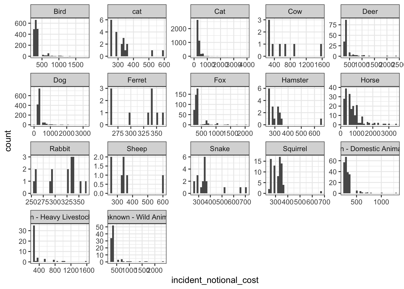
base_plot + geom_density()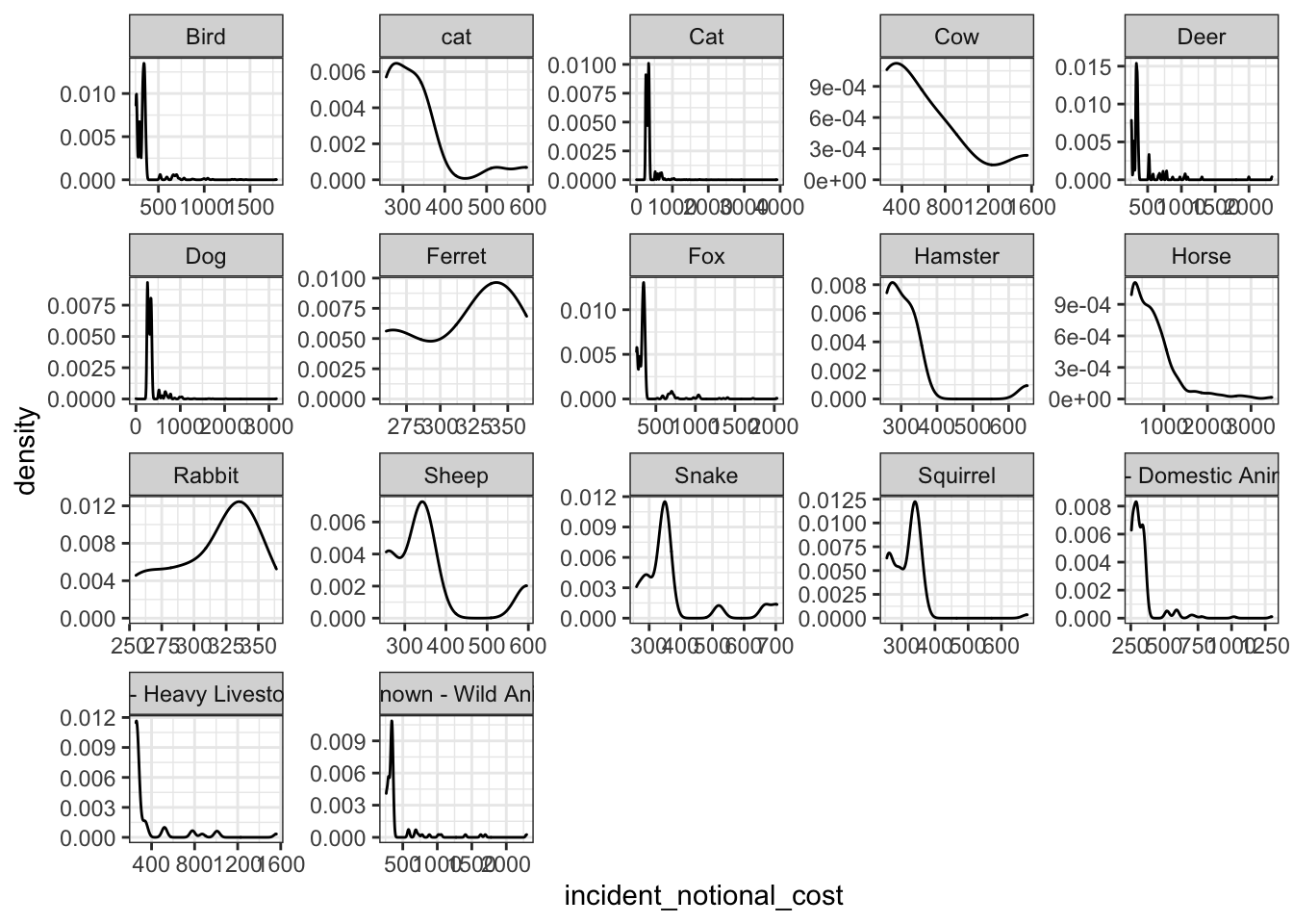
base_plot + geom_boxplot()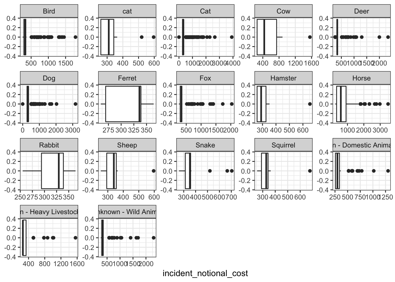
base_plot + stat_ecdf(geom = "step", pad = FALSE) +
  scale_y_continuous(labels = scales::percent)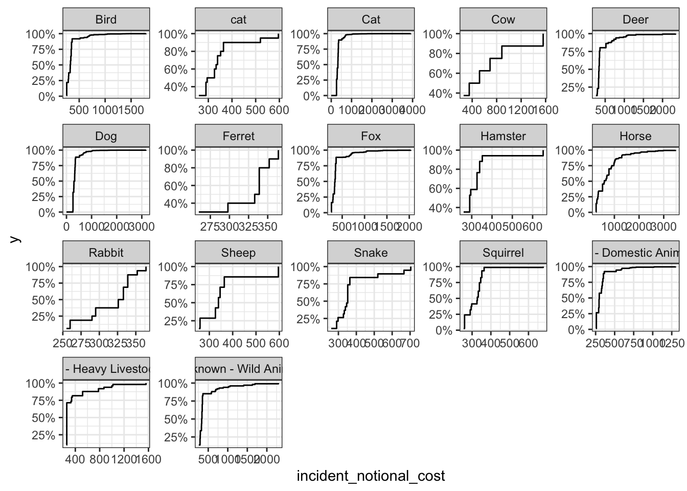
Which of these four graphs do you think best communicates the variability of the
incident_notional_costvalues?
I think boxplot best perform the task. It indicates the mean, spread and skewness of these values.
Also, can you please tell some sort of story (which animals are more expensive to rescue than others, the spread of values) and speculate about the differences in the patterns.
The distribution of rescue cost has different patterns regarding different animals. - Animals like horses are very expensive to rescue. It’s not only because the median rescue cost is higher, but also some individual hourses are very expensive to save. - For small animals like ferret and rabbit, their rescue cost is quite close, without significant outliers. - Bird, deer and fox are animals that have many outliers (individuals that rescue costs are much higher.) Some of these hurt animals are much expensive to rescue, maybe due to its physical condition and kinds.
2. Social Links
You can view my past experiences on LinkedIn.