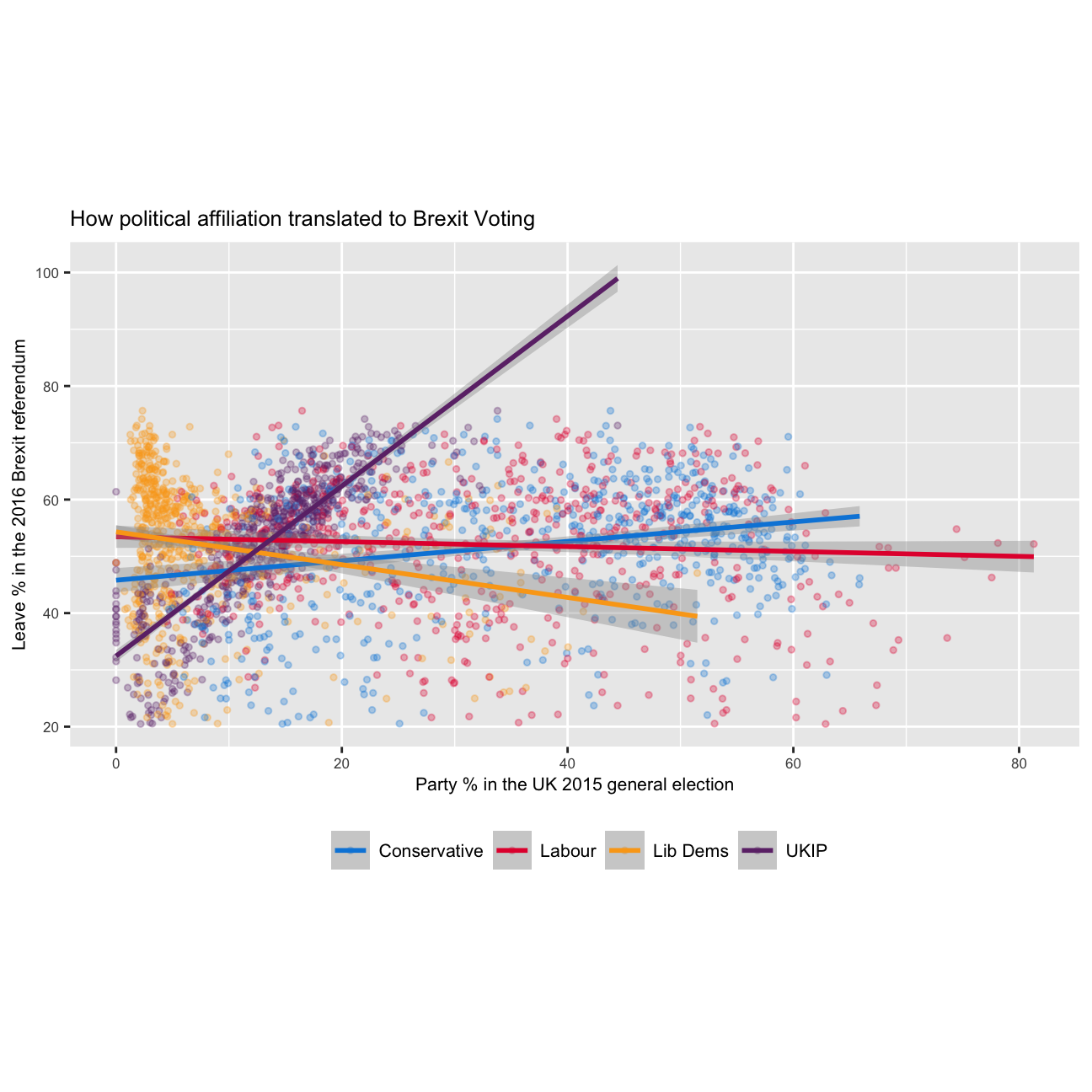







I used the Brexit results dataframe to generate a scatterplot to show How Political Affiliation Translated to Brexit Voting.
From Wikipedia page Index of United Kingdom political parties meta attributes, I got the hex codes of given Parties.
Here comes the code:
brexit_results <- read_csv("https://raw.githubusercontent.com/kostis-christodoulou/am01/master/data/brexit_results.csv")

brexit_long <- brexit_results[1:6] %>%
  pivot_longer(cols = 2:5, names_to = "party", values_to = "party_pct") %>%
  mutate(across('party', str_replace, 'con_2015', 'Conservative')) %>%
  mutate(across('party', str_replace, 'lab_2015', 'Labour')) %>%
  mutate(across('party', str_replace, 'ld_2015', 'Lib Dems')) %>%
  mutate(across('party', str_replace, 'ukip_2015', 'UKIP'))

ggplot(brexit_long, aes(x=party_pct,y=leave_share, colour = party))+
  geom_point(size = 1, alpha = 0.3)+
  geom_smooth(method = 'lm')+
  theme(text = element_text(size = 8),
        aspect.ratio = 0.5,
        legend.position = "bottom",
        legend.title = element_blank(),
        legend.text = element_text(size=8))+
  labs(title = 'How political affiliation translated to Brexit Voting',
       y = 'Leave % in the 2016 Brexit referendum',
       x = 'Party % in the UK 2015 general election'
       ) +
  scale_colour_manual(values = c("#0087DC", "#E4003B", "#FAA61A","#6D3177"))